
In the world of innovation, design, and engineering, there’s a phrase that gets thrown around among creators and tinkers: “Your first prototype will be ugly.” But is that really a universal truth, or is it just another design culture cliché? This article dives deep into what prototypes really are, why early versions often look unpolished — and sometimes downright unattractive — and how this “ugliness” can actually be a sign of strength, not weakness.
We’ll explore psychological biases, practical strategies, historical examples, and professional practices that show how the appearance of a prototype hardly determines its eventual success — and why genius often begins in messiness.
What Is a Prototype? A Clarified Definition
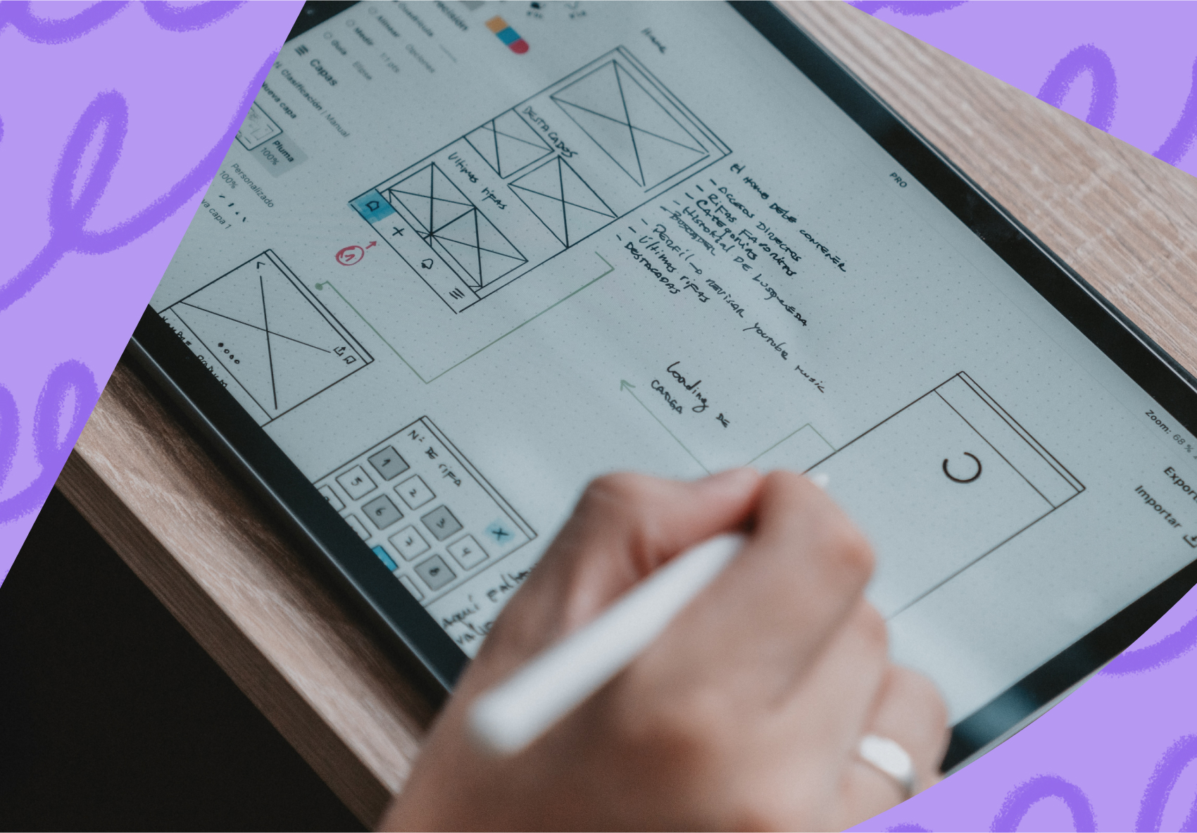
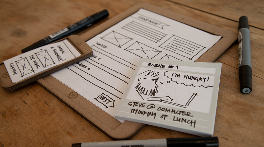
Before we tackle “ugliness,” we need to define what a prototype actually is. Simply put, a prototype is an early sample, model, or release of a product built to test a concept or process. Prototypes serve as tools for learning, feedback, refinement, and problem spotting long before final production — and they vary widely depending on purpose. They can be paper sketches, digital mockups, or rough hardware builds.
Designers often distinguish between low‑fidelity and high‑fidelity prototypes:
- Low‑fidelity prototypes are quick, low‑cost, rough iterations meant to capture idea essence and test basic assumptions.
- High‑fidelity prototypes look and behave closer to the final product, useful for user testing and performance evaluation.
But both start rough — because prototypes are tools for exploration, not polished products.
Why First Prototypes Often Look Ugly
1. Prototypes Are Tools for Learning — Not Showpieces
An early prototype’s job isn’t to impress, it’s to reveal the truth. It’s a probe into uncertainty, meant to uncover hidden problems and unmet assumptions. When teams focus prematurely on appearances, they risk losing sight of the real goal: finding what works and what doesn’t. In fact, research suggests that early low‑fidelity prototypes help nurture creativity by concentrating team attention on core ideas, not superficial aesthetics.
2. Material and Process Constraints
Often, the materials available at the prototyping stage are inexpensive and not representative of the final product. Designers use substitutes like cardboard, cheap plastics, foam, or temporary software code. These materials might look unattractive, but they enable quick iteration and low risk.
When engineers and designers build prototypes, they might not even use the final production process or materials — and that’s intentional. What matters early on is whether the design works, not whether it shines.
Ugly by Design: When Roughness Is a Feature
Good Design Requires Iteration — Ugly Helps You Iterate
Robert Pirsig, author of Zen and the Art of Motorcycle Maintenance, spoke about quality as something you discover through practice, not a label you assign accidentally. This philosophy carries into prototyping: the roughness is part of discovering what quality actually means in context.
Early prototypes tend to be ugly because they are built quickly, tested fast, and thrown away or refined rather than polished. This is a practical embodiment of the “fail fast” mindset: rapid learning beats slow perfection.
Focus on Function Over Form
When a prototype is ugly — messy wiring, rough 3D print lines, patchy software interfaces — it forces designers to prioritize functionality over form. Functional insights gained early often lead to higher‑quality final outcomes because the team isn’t distracted by aesthetics before core mechanics are proven.
This principle applies across industries, from automotive to software to industrial design. Whether you’re prototyping a new electric vehicle interface or testing a mobile app’s core loop, rough prototypes uncover usability issues that beauty can mask.
Case Studies: When Ugly Prototypes Led to Success
Software Prototypes That Worked Despite Being Ugly
In software development, it’s common to build quick throwaway prototypes — often using placeholder graphics and basic code — to test a concept or mechanics long before UI or visuals are considered. This speeds up product discovery and helps teams avoid building the wrong thing under the guise of polish.
Some prototypes that seemed ugly or simplistic at first have gone on to become major successes once refined. For instance, many indie game developers start with blocky placeholders and basic shapes to validate gameplay. Only after the core experience is proven do they invest in art and polish. This workflow ensures visual upgrades aren’t wasted.
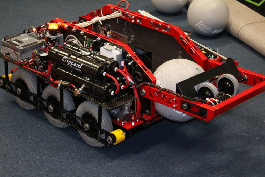
Hardware Prototypes: Practical Ugly Beats Pretty Futile
In hardware, too, there’s a long tradition of ugly proof‑of‑concept builds: hacked‑together boards, repurposed parts, and duct‑taped chassis. They rarely look finished — but they work. Many hardware startups adopt this mindset because solving engineering challenges early outweighs superficial attractiveness.
Does “Ugly Prototype” Mean Poor Quality Thinking?
Not at all.
In fact, ugliness often signals that a prototype is fulfilling its purpose: probing assumptions, revealing constraints, and prompting iteration.
Instead of assuming that aesthetic polish is always tied to quality, modern product teams understand that ugly prototypes help teams think more critically. They help strip away biases, forcing designers to focus on what matters most: usability, function, and real value.
When Does a Prototype Stop Being Ugly?
As development progresses, prototypes gradually transform:
- From rough sketches to functional models
- From quick throwaways to high‑fidelity proof of concepts
- From concept sketches to beta versions ready for user testing
This evolution isn’t linear or predictable; it’s iterative. Each loop brings improvements, feedback, and refinement. What starts ugly can become elegant — but not without the hard work of discovery. This iterative philosophy is foundational in design thinking and human‑centered design practices.
The Psychology of Aesthetics in Prototyping
People have cognitive biases toward beauty and coherence. An early prototype that looks slick might lead stakeholders to prematurely judge success before real problems are uncovered. Ugly prototypes, by contrast, provoke critical thinking and honest critique. This dynamic helps teams avoid the “aesthetic veil” that can hide deep issues.
Experts often emphasize that readability and usefulness in early versions far outweigh design — and comfort with the unattractive becomes a professional strength. Designers who learn this early save time, resources, and frustration.
Best Practices for Embracing Function‑First Prototyping
If you want to prototype like a pro — and stop worrying about how it looks — here are some professional tips:
- Define purpose first: Know what you are testing before worrying about appearance.
- Use the simplest tools: Paper sketches, basic code frameworks, and quick builds reveal core issues fast.
- Iterate fast: Frequent cycles uncover patterns and avoid costly late redesigns.
- Separate aesthetics from core function: Only refine visuals once logic, usability, and mechanics are proven.
- Collect real feedback early: Ugly prototypes invite focused critique that polished versions can avoid.
This mindset shift helps design teams become more resilient, creative, and pragmatic.
Conclusion: Ugly Isn’t a Bug — It’s a Feature
So are all great prototypes ugly at first? In most cases, yes — but ugliness is not the problem. It’s a strategic starting point. Ugly prototypes are humble, honest, and unpretentious; they help teams ask the hard questions before spending too much time on superficial polish.
Great innovation often begins in imperfection. What looks ugly first can evolve into something beautiful — but only if its initial purpose was uncovering truth, not hiding behind aesthetics.